Showing posts with label scrapbooking. Show all posts

Wednesday, 11 March 2020

Coordinating scrapbooking papers and embellishments with Karen


I teach lots of workshops and here in France scrapbooking is particularly popular. I am currently working on my new album that I will be teaching for the first time at the end of March and I always like to include different techniques that the participants can apply to other projects. This time I am putting Brusho Crystal Colours at the fore to enable the groups to decorate their own papers and matching embellishments. I had already selected some printed papers (Florilèges Design) and plain cardstock papers so I needed the Brusho colours to coordinate with these. I chose Prussian Blue with a little Emerald Green.
I had already cut some plain white paper to the size I wanted. I sprinkled these with Prussian Blue Brusho Crystals and sprayed on some water then added a little Emerald Green to get the hue that I wanted. I used a paper towel to remove excess water and soften the colours for the background. I am delighted with the result. These papers were used to line the inside covers.


I then used the ColourCraft Tray with its air tight mixing pots to make up some pots of a mix of the two colours in water. I used this with a large round brush (size 9) to add colour to the centre of some white flowers and draw it out along the centre of the petals.

I also added the same colour to the black and white image of this camera. I am very happy with how this album is now coordinated with original papers, matching flowers and on-trend water colouring. I hope you have enjoyed these sneak peeks of the album and that this inspires you to use Brusho colours to coordinate your projects. Above all, I am hoping that the groups like the album as much as I do.

Thanks for visiting
Karen
x

Saturday, 6 July 2019

MORE Shaving cream marbling!

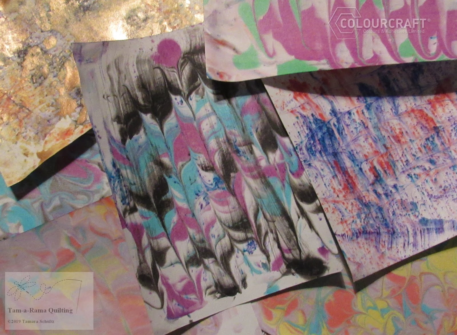
Hello! Some months ago I did a bit of shaving cream marbling with fabric paints on fabric- I wanted to do some more experimentation with other Colourcraft products and that's what we are going to look at today! If you want some more info, check out the previous blog post here.
These papers were done with Brushos and Colourcraft Drawing Inks
The video showing the basic technique is:
I want to play around a bit more with Brusho's- here is a close up of one of the effects I got:
The inks gave a more traditional marbling feel:
My favorite effect was combining both techniques! 
I decided to use some of my papers as covers for small books!

I hope you enjoyed these techniques!


See you next time!


Wednesday, 3 July 2019

One layer scrapbooking page by Karen

This project started with a plain white page and my photo and I selected the materials I initially thought to use. As usual, that all goes out the window once I get started!


As I sprayed the paper with water and then sprinkled on Lime Green Brusho Crystals I swiped it across the page with a paper towel and then dabbed the Cobalt Blue to soften the colour too.

Liking the result so far, I diluted some Emerald Green and used the same paper towel to dab that over a compass shaped mask for a background detail.

To add more detail, I stenciled some Design-It paste in glossy white in three different places. I then used my favorite technique for stamping with Brushos: I rub the powder, in this case Emerald Green, dry and directly on to the stamp with my finger and then spritz the stamp with water. This allows repeated stamping and gives a soft watercolour effect. If the colour starts to fade, another spritz of water allows several more stampings.
(Quick note on this technique: The intensity of colour in Brushos can stain transparent stamps although they are not harmed by this. Also be careful to wash your stamps thoroughly after using this technique so that the colour doesn't transfer at a later date.) 

As I was then happy with the background, I added the photo, some stamping and a border to finish the page. Whilst I feel everyone has to scrapbook to their own style, I like to keep my scrapbooking pages flat as they fit easily in to an album and I also like to keep the photo as the focus without lots of distracting papers and embellishments. I deliberately used a large format for this page so I didn't feel it needed much else. I hope you like it: It brings back happy memories of a fabulous spot, Ballycotton in Ireland, that we found purely by chance.
Thanks for stopping by.
Karen

Saturday, 8 June 2019

Pastepaper with Aztec Acrylics by Colourcraft

Today's tutorial is more about technique than a particular project.
Paste papper is a classic way to make designs on paper for bookbinding and what can be more fun than metallic colors on a black base?
For an overview of the process- check out the  Video here! 

Basically, I gathered together my materials- wallpaper paste (there are many different paste paper recipes online), Aztec Eco Metallic Paint , brushes, combs and other marking tools. Paper as well of course!
The process is simple- blend the paint with the paste, sponge down your paper with plain water to "relax" it, paint and then comb through or stamp to get different effects before the paint dries.

To get a different effect on my black paper- I sponged on some gesso in spots.
Let dry and then use your papers to bind books, as backgrounds- so many possibilities!
The above effect was made with an empty spool of thread.

The piece above had some gesso sponged onto it and was combed in different directions.

In this piece I tried to get a plaid effect.

This piece had gesso and was stamped with an Indian wooden stamp. After it was dry, I added some Brusho to get the funky color effect.

I hope you enjoyed this technique!


Wednesday, 13 February 2019

Scrapbooking vintage photos by Karen


Do you have collections of old photos lying in drawers and boxes? I think many people do. When my husband inherited a huge number of family photos stretching back several generations most were loose and the only photo album was literally falling apart so I took on the massive project of organising and storing these in a new album using divided page protectors. I bought a pack of papers and have been using these to layer the photos on to but needed embellishments and wanted more variety in my backing cards: Brusho Crystal Colours to the rescue!


With my fairly neutral colour scheme and the vintage photos in mind, I chose my Brusho colours and cut 120 g/m² paper to the size needed. I sprayed the papers with water and sprinkled on the Brushos. I used Cobalt Blue and Moss Green, Grey and Light Brown.


I created extra papers by spraying a little more water and using a paper towel to blot off excess colour on to another paper, turning it to get a random, marbled effect.


The offcuts of paper were kept for die-cutting embellishments so I coloured these with brighter shades that would match my backing papers. I used Burnt Sienna and Sandstone, Gamboge and Sandstone and Turquoise. I also used a wash of Light Brown on another piece.


With everything dry and the die-cutting done, I had a good stack of papers and flower embellishments ready to add to my album, even more than shown above. I also included die-cut flowers from a left-over piece from <this project > using Aztec eco paints.


I added a freehand border to the background cards, some stamping, notes about the photos and Nuvo Drops to the flower centres before adding the photos with clear photo corners. Above is part way through the planning stage. Below is my finished layout, just before sliding the cards in to the protector, with some blue added to upper rows to draw everything together.

Some tips and points to remember when scrapbooking vintage photos:
  • Everythng needs to be kept dry: Damp damages photos. Keep the photos away from your work area while you are spraying water about! As long as the papers created with Brushos are kept dry, they are archival and photo friendly. 
  • Keep everything out of sunlight: The Brushos are lightfast, photos are not!
  • In a large album, let the colour scheme and other features evolve, avoiding sudden changes: I have plenty of flowers and other pieces of card left from this layout and my previous pages have the same brown cardstock I used in the middle row and the same die-cut flowers on them. Adding brusho coloured pieces to previous and following pages, will help this layout blend in with the others.
  • Avoid anything touching your photos that could do them harm: Always use acid-free papers, inks, glue and embellishments to avoid the photos deteriorating. 
  • I use clear photo corners to avoid the photos being stuck down permanently: The photos are protected but are also free to be scanned, examined and rehoused in a new album if necessary. If possible, I recommend scanning the originals as a back up in case they get damaged. Most scanners take A4 size so photos can be done in batches rather than individually: Much quicker and you can name the file with the year followed by who and where so they stay in chronological order.
  • Get as much information about the photos as possible and record it alongside them: Future generations will thank you!

I hope you are inspired to get those old photos out and show them some love!
Thanks for reading
Karen


Related Posts Plugin for WordPress, Blogger...