

Hey there!
I think we can safely say Happy Autumn!
I've a painting today on the blog that is really inspired by autumnal colours and a little spooky too.
The place in the painting is called Mow Cop, it's an iconic Cheshire landmark, full of history and makes a great subject for practicing texture techniques.
I have used oil pastels to capture a wonderful rough surface adding a diverse range of marks and drawing quality using the resist method.
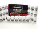
I love combining media to achieve different results and the oil pastel and Brusho really compliment each other.

I began by drawing out the castle ruins with a HB pencil on Watercolour paper.

I then grabbed a selection of oil pastels and scribbled the colours in turn over the paper. keeping in mind to use differing pressures so that some pastel was heavier and completely covered the paper and some pastel marks were lighter and dragged over the surface.

I applied a light peach/cream shade over the castle itself and a blue for the windows. I wanted to capture the ridges and grassy textures of the ground by scribbling in layers of colour and adding lines for grass

Once I was happy with the amount of oil pastel I used a soft brush to apply water to the sky area and I sprinkled Brusho in Grey and Cobolt across the top of the paper. Using the brush with lots of water I smoothed in the Brusho sprinkles in a diagonal direction. Allowing the water to dilute the colour and tipping the paper for a soft graduated wash.

I dried the sky and mixed a Dark Brown Brusho on a palette with some water and painted it over the castle. I could see straight away the effect of the oil pastel in keeping some nice light areas.

It was then time to inject a splash of colour. I spinkled Brusho directly onto dry paper in and around the oil pastel marks for the hill and grass. I used an array of colours such as Cobolt, Turquoise, Yellow Ochre, Grey, Light Brown Lemon and Brunt Sienna.

I made sure to sprinkle each colour separately onto the paper so that there would not be too much overlap of each colour and therefore avoiding a muddy mix. I could have painted each colour on one at a time as another option.

The Cobolt and Burnt Sienna blend really nicely here with a pink oil pastel colour showing through in between.

I blended the Brusho shades through the middle and decided to leave the edges with less. Also flicking the Light Brown Brusho with a Brush and painting lines that represent the grass right in the foreground.
Below are two other examples with slightly varying colour schemes that I have demonstrated in my classes recently.
A little more attention was paid to the details in the Castle ruins and the rock and hill as well as a more adventurous sky colour.


This technique is great for capturing the rough surface of the stone/ walls especially of old buildings such as this, but also for movement and directional lines such as the grass blowing in the breeze.
I hope you like it and may be inspired to have a go at your own old building using oil pastel resist.
It would be great to see what you get up to.
Bec
 |  |  |  |  |

This method has just opened up a whole world of possibilities for me, thanks for the inspiration
ReplyDelete