Showing posts with label DesignIT Paste. Show all posts

Wednesday, 20 May 2020

Art Journal Cover by Karen

For today's post I thought it was time I decorated the cover of my art journal. What to do if you want some texture but without things that will catch and tear? Tissue paper and different texture pastes was my answer.

Manila paper tends to suck the colour out of everything and I wanted to have a bit of white space so I started with a layer of white gesso, feathered out so there were no hard lines. Then I added a bit of light background stamping and stamped my title on to tissue paper.

I painted the back of the tissue paper white so that it would stand out against a coloured background...

and I added Turquoise acrylic paint to the cover, again feathering out to avoid hard edges.
For a pop of contrast and some texture, I mixed Magenta paint in to transparent relief paste (now called Design-It) and stenciled this over the other colours.

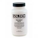
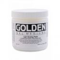
To take the title stand out more, I added a light touch of Cadium Yellow and used gel medium to stick down the tissue paper adding a coat under and over to be sure it was well adhered. I added a third lot of stenciling too.

Mixing Yellow and Scarlet paint for a bright orange, I added more stenciling and doodled round the stars and circles with black and white pens. I used Black Acrylic Paint to sponge round the edges of the cover.

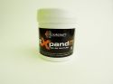
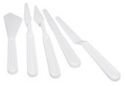
For more texture and contrast, I stenciled Black Expand-IT paste on to the cover. I also added lines with the edge of a paint knife to the 'Art' letters, and heated the Expand-IT to puff it up for some volume.
I am sure I will continue to doodle or add to this over time but, for now, it makes me happy that my journal has a decorated cover in some of my favourite bright colours. It gives a hint of what is inside. More of that another day!

Bye for now
Karen
x

Wednesday, 13 May 2020

Mixed Media Canvas with Suzi

Good Day All, I hope you are keeping safe and well, Today I'd like to share with you a Mixed Media Canvas I've created using DesignIt Paste, Brusho Crystal Colour Powders, Eco Acrylic Paint and Gold Wax Crayons.

I had no idea where I was going with this canvas when I started it, I just wanted to play and see what would appear.

Here's the finished Canvas;

 
Here's how I went about making it;

First of all I took an 10 x 14 inch canvas and applied a layer of Pearl DesignIt paste through a stencil.


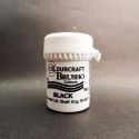
I then selected three colours of Brusho Crystal Colour Powders, Gamboge, Sea Green and Purple and sprinkled them over the DesignIt Paste.  To be honest I was a little heavy handed which leads to me having to add a clean up stage to this project.


I then left the canvas to dry overnight.


As you can see the Pearl DesignIt Paste has dried to a lovely pearl finish, but there is alot of excess powder.  So the next thing I did was using damp kitchen towel I removed as much of the excess powder as I could, really focusing on the blank canvas areas as I wanted to add some paint into those areas.


As you can see the blank canvas areas are now nice and clean, and the Pearl DesignIt paste is still nicely coloured.  I then painted all the areas of blank canvas with Eco Acrylic Paint in Paynes Grey.


I liked the contrast between the Grey and the coloured areas but wanted a bit more, so I added some Gold Wax Crayon to the Grey areas.


At this point I really liked the contrast between the areas, but it all seemed way to busy.  To be honest I hated it at this point.  I was seriously considering binning it and starting all over again, but then I thought I could paint over it with Gesso, which led me to decide to get the Black Gesso out.  
After a little thought I realised that I could cover some of the canvas with the Black Gesso but leave some of the patterned area as focal points.  I created a Heart shaped mask out of a piece of white card stock, and painted around it with Black Gesso.


I loved the result, it really highlighted the design and no longer looked too busy.  When applying the Black Gesso, I'd left it patchy in places, so you'd get some of the texture coming through from the background.

To finish the canvas I decided I wanted to add a sentiment, and a little doodling and frame the hearts.  I chose to used the Gold Wax Crayons again as this would tie the whole thing together.  After a little thought I decided on 'You and Me Always' for my sentiment as it filled the space nicely, and connected to the heart theme of the canvas. As a final element I added a little doodling with white pen.


I'm pretty pleased with the finished canvas, It's still not one of the my favourite projects but i'm happy with the end result and glad I didn't give up on it halfway through.  We can't love everything we create, but some project are more about learning what works and what doesn't, and just seeing where the project wants to go itself, it's organic and raw.

I hope you've enjoyed seeing how my project came together and reading about the turmoil it caused me.  I think it's important to share projects that don't work the way we want, It helps to show that none of us are perfect, and that our projects don't always turn out how we planned.  We are all still learning, and that is part of the fun.

Thanks for visiting with us today
Stay Safe and Well
Bye for now
Suzi
xxx

Wednesday, 6 May 2020

Art journaling 'Dream Tomorrow' by Karen James

I've returned to my art journal and ColourCraft Acrylic Inks for another double page spread.


I used warm tones - Golden Yellow, Orange, Scarlet and Deep Crimson - for the background and then contrasting Turquoise, Emerald Green and Cobalt Blue for the focal points with Copper Design-It paste giving more texture and a lovely sheen.
I filmed the process so you can see how all the layers are built up. It is edited to keep it short and I've given a voice over with lots of art journaling tips and tricks: Hope you enjoy it!


Please don't forget to subscribe to the ColourCraft channel while you are there.
With thanks for spending your time with us.
Karen
x


Wednesday, 22 April 2020

Springtime mixed media canvas by Karen


The starting point for this project is a large A3 size art panel and an A4 printed tissue paper to which is added lots of ColourCraft goodness. I divided the tissue paper up by painting water lines where I wanted it to tear: This makes rough lines that disappear more easily in to the background. I used Collage Gel to adhere these pieces to the panel. When it was dry, I stenciled over this with White Relief paste.

I also added transparent Design-It Relief Paste over the bee wings and mixed in some Yellow Brusho Crystals to the paste to colour the lower body while giving it some gloss and 3D relief. I did the same on a stamped bee to add later.

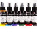
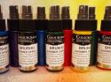
Once the paste was dry, I sprayed the panel with Brusho Acrylic Mist Spray in Sea Green and Turquoise, plus Gold Acrylic Shimmer Spray over the stenciled flower heads.

A little close up of how the bee came out with the Relief Paste resisting the colour spray:

As the tissue paper soaked up more colour, I softened the difference between the paper and the canvas art panel by stamping some flowers and background stamps across these and filling in gaps. I stamped some text on to white paper and then sponged some Gold Brusho Shimmer Spray on to it so it wasn't quite so stark against the background and added these with 3D foam.

Finally I added my third bee on some more 3D foam:

The text encourages us to take time, time to laugh, to cry, to love, to dream and simply to live.

Thank you for spending time here today.
Karen
x
Related Posts Plugin for WordPress, Blogger...