Wednesday 31 May 2017

How To Create Amazing ATCS With Brusho Powders By Katie


Hello crafty friends

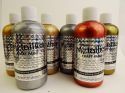
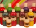
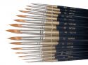
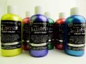
 Today you are going to learn how to create these amazing ATCs by using brusho powders as an ink to colour in with. I have also included a few short videos to show you how to use a water pen with brusho powders.


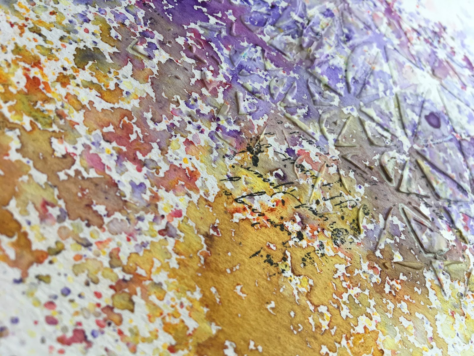
I started off by covering an ATC blank with gesso and then i added a stencil mask over the top.
Next i sprinkled Red Rose down the middle and painted it along the centre and edges using a water brush.

See video


Next i sprinkles Lemon brusho powder onto the white areas and coloured them in with a water pen and blended the colours a little.


Next i painted some dry wall tape with Aztec Metallic Lustre . 
Once dry i peeled it off and cut it up before adding it to the ATC. I then added another stencil mask over the top and this time i used crackle paste.


i used a cog die cut and cut out the shapes from white cardstock which i painted with gesso first and then i coloured in using Brusho powders.I finished off by adding a stamped image to the centre.


For this ATC i added a stencil mask using modeling paste. Then i added  Ultramarine and Purple Brushos before  blending the colours together. I added the painted wall tape around the edges and applied gesso down the centre with a palette knife before stamping over the centre.


The butterfly i created by die-cutting a shape from card. I painted it with gesso and then applied a stencil over the top using modeling paste. I soaked the butterfly with water and added colour using purple and Rose Red. I love hoe the modeling paste absorbs the colour when it dries.


I added a mini peg to the centre for the body and finished off by stamping out a sentiment.


I added a bit more texture around the edges with a texture stamp.


I painted the base with gesso and then spritzed water into the corners before adding Green Leaf and Lime brusho powders. I then stamped around the base with texture stamps and added a stencil mask.


The word is stamped out in card and coloured with Olive Green Brusho so i blends in with the rest of the project.


The Flowers have been stamped out onto card and coloured in using Lemon, Emerald and Olive Brusho powders. I wanted to create a blended effect so i used my water brush to guide the colours together.


I decorated the flowers with self adhesive gems and dotted a few half pearls around the ATC.

Thank you for visiting and i will be back soon with another technique tutorial.

Monday 29 May 2017

Box frame Butterflies by Terri Koszler

Hello Terri here today to share a project I've made using the Aztec Metallic and Metallic Lustre paints.


I love a home decor project and wanted to create something a little bit different. I've always been a fan of those box frames with butterflies in, but they are normally a vintage style.

I wanted something with a little more of a mixed media style.


I started out by colouring some thin card with metallic paint using a spouncer, as well as this copper colour I also coloured another piece of card with the metallic blue (but forgot to take a photo)


I used a mini spouncer to stipple through a stencil to add some interest to the the copper background, I didn't want a solid pattern that would distract from the butterflies so I lightly stipples in random areas.


Next I used my Gelli Plate to create an interesting piece card to cut butterflies from.  

Normally I use the Gelli Plate with Acrylic paint as it is thicker and sticks to the surface but what I have discovered it that because the ECO Atztec paints are water based when they are applied to the surface using a brayer they start to bead making little beads of metallic gorgeousness (my daughter is mesmerised by this effect and says that they look like blobs of solder)

To create my effect I applied the copper and lifted a print, then applied the blue and took a print on the same piece of card layering one colour on top of the other.


I had a piece of copper card that I had coloured with a few coats of the copper, I punched butterflies from it.


I did the same in Blue and the Gelli printed card


I then layered these up, I used a solid colour on the bottom and a patterned on top. I used a minimal amount of glue as I wanted to lift the wings.


I then added some of the papers I created into a box frame


and then added the butterflies in a 3x3 formation.


I love the vibrancy of the paints and how easy they are to work with.

I hope you've enjoyed today's post, please pop back on Wednesday for more inspiration from one of the Colourcraft DT.


Friday 26 May 2017

Blue Anemones in Brusho with bleach by Rebecca Yoxall

Hi everyone,

I would like to share a flower painting in Brusho today. I chose the beautiful Anemones and found that the Cobolt and Purple Brusho mixed together provided me with a perfect shade. Adding flourishes with Black, Moss green and Turquiose in later stages and of course bleach!


Firstly I used an HB pencil to draw an outline of the flowers.


I then sprinkled some Cobolt and Purple onto a palette and mixed them together with a brush to produce my desired shade of blue. Painting a petal at a time I added water to dampen each petal then dropped in the colour with the brush allowing it to flow within the petal shape but leaving some areas of paper to show through. Perhaps work on alternate petals so that they don't run into each other.


Once the flowers were painted and dried I re-wet the centres only and sprinkled the Black Brusho directly onto that area. Black is a wonderful colour as it is made up of lots of different pigments and these show up when sprinkled in this way.


The next stage would be optional (as not everyone would like to use bleach) I grabbed my lovely bamboo pen and dipped it into a small amount of bleach in order to lift out some lines on the petals. I use normal household bleach but obviously take great care when using it. 


Each flower is created with varying degrees of lifting and sprinkling with the black making each one unique. 


For the background I decided to mix a very diluted purple on my palette so that it flowed very softly in suggestive leaf and foliage shapes around the flowers. Whilst that wash was still wet I sparingly sprinkled Moss green and Turquoise. I worked slowly and gradually building so that the colours remain fresh.


Finish with a flick and splatter, the odd little leaf in the moss green and maybe a bit more bleach to unify the background.

Wishing you a great day. Do leave a comment and if you have a go let us know how you got on :-)


Wednesday 24 May 2017

Vintage look on wood with Aztek Metallics craft paint by Kate

Hi, 

I don't have a paper project for you today; today, we will be painting a wooden box. 

I received this wodden box from a friend but never had any use for it so I decided to paint it with the Metallic Aztec Paints. Originally, the Aztec paints are not designed to be used on wood but I found out that they do work and give it an awesome vintage look!


Here is my step-by-step:

1. I painted the box with white acrylic paint. I used the heat tool for drying the paint - it really saves time.


2. Next, I took painter's tape and I made strips with it so I had guidelines where to paint (I wanted to have stripes on my box and that was the easiest way to make it).
To have a more vintage look, paint a maximum of 3 layers (with more you will loose that vintage look). Since Aztec Metallic paint is not for wood, one layer is not enough. Believe me.


3. After drying, remove the painter's tape (you can use washi as well) and here it is... a completely new box.


And here you can see, I am using my stripy box for organising dies.


Have a nice day
Kate Dachovska


Monday 22 May 2017

Easy Brusho Art Journal by Ewelina Gryglak

Hello!
It's my turn again and this time I would like to share with you an easy and fun art journal spread.
Whenever you feel the need to make something pretty but only have a couple of minutes to spare... this one is for you!


All you need is your art journal (of course!), black and white pen, stamp, black ink pad, a stencil, texture paste and 3 of your favourite Brusho powders (yes - 3, you will have to make some difficult decisions here!) - go for two analogous colours and one colour to complement them. I went for Violet and Purple and chose Yellow to complement them.


Here we go... let's do it!


Start by drawing a frame around the page with a black pen.


Stamp out some background designs - focus them mainly around the middle of the page as this is where the whole design will be focused. 


Run texture paste through a chosen stencil. you don't have to fill in the stencil completely - let it be slightly grungy; this will allow the Brusho to flow more freely, too.


You can skip this step but I always test the powders I have chosen to make sure that the colours work well together. 


Sprinkle the analogous colours (Violet and Purple) over the stencilled area and the complementary colour (Yellow) on the edges.


From a distance, delicately spray the page with water. Don't spray it too hard as this will cause the colours to blend and you will loose the spotty effect and the various shades of pigment.  


If any of the colours is not vibrant enough, sprinkle some more powder where you want it - the water already on the page will make it dissolve.


Dry it with a heat gun or, if you're patient enough, leave to air-dry.


Once completely dry, use white pen to outline some of the stencilled shapes on the background.


That's it! Quick and simple!


You can also watch the tutorial on our YouTube channel:


Thank you for joining me! Have a great day!

Ewelina


Related Posts Plugin for WordPress, Blogger...