Friday 30 November 2018

Art Journal Page by Susanne

Hi there!

I have a new art journal page to share with your. I used one of my favourite techniques. It is Brushos together with some embossing. I love how vibrant this turns out.


Here is a video tutorial:


Here are some close-ups:


Thank you so much for stopping by today!
xx Susanne

Supplies:

Wednesday 28 November 2018

Wax Resist Canvas with Suzi

Good Day All, Today I'd like to share my latest creation using Brusho Crystal Colours, Wax Resist Crayons and DesignIT Soft Form Relief Paste. I decided to make a Mixed Media Canvas, which I plan on giving my Dad as a Christmas present.  Here's how I created it.

First of all I took a piece of Watercolour Card and a Piece of Cartridge Paper, a Texture Plate and Wax Resist Crayons.  I wasn't sure how well the Texture plate was going to work with the different thickness's of paper.

On the left is the Watercolour Card, and on the right is the Cartridge paper.  I used Brusho Crystal Colour in OST. Blue and Turquoise.

Here is the Cartridge paper with some Sea Green Brusho Crystal Colour added.

Here is the Watercolour Card with some Sea Green Brusho Crystal Colour added.

Next I took a 5 x 7 inch Canvas Board and collaged some of the Cartridge Paper and some piece of old road map. I added some White Gesso and left to dry.

Once dried I added some Shimmering Aquamarine DesignIT Soft Form Relief Paste through a stencil onto the Canvas.

The next step was for me to create my focal points.  I decided to stamps a couple of images onto the Watercolour card that I'd added the wax and Brusho's too.

I used a stamping platform to make sure I got a really good impression on the card.

Next I added some background stamping to my canvas before adding the images that I'd cut out.

To finish my canvas I added a little more background stamping, and inked the edges of the canvas.
Here's a couple of close ups;


I had lots of fun working on this canvas, I love the resist effect you get with the Wax Resist Crayons; and the DesignIT Soft Form Relief Paste is so thick and creamy, and has a lovely shimmer.

I hope you've found my post interesting. Thank you for taking the time to read it.
That's all from me for now
Bye for now
Suzi
xxx

Saturday 24 November 2018

Creating Depth with Brushos on Fusible Web


Greetings everyone! November is winding up and I thought I would follow our Design Team's theme today "Layers" by showing you a super easy way to add extra depth to your art quilt projects using Brusho on fusible web!


I started by cutting out a couple of pieces of a fusible web. I sprinkled on some colors of Brusho powders (violet, purple, prussian blue, ost. blue and lime green), and then spritzed with quite a lot of water.

I just love how the paper underneath scrunches up  making the Brushos blend and pool! 
While these dried, I got out some fabric which I had ice dyed this summer with Colourcraft Procion Dyes. It doesn't have to be summer to ice dye! Actually, if you live somewhere where you already have snow, you can use the same technique that's in the blog- just leave it longer! 

When my they had dried, I peeled off the fusible off of the backing paper . The backing paper is great for collages! Here you can see the backing paper and the peeled off fusible. Don't worry! There is plenty of color left on the fusible to get a cool effect!

Then it's just a matter of placing the fusible on top of your fabric pieces and pressing into place- make sure to use parchment paper to protect your iron though! I've taken some before and after pressing pictures, the colors get brighter and stronger after you press them- that's because the fusible looks white, but turns clear after pressing!


You can see how it adds depth to my original fabric! I decided to leave the first one as it is at the moment- I think i will be a great base to an embroidered landscape, but I wanted to do more to the second, so I got out a stencil I found at Panduro and taped it onto my background. I put some navy blue and turquoise opaque fabric paint onto a palette and used a stencil brush to dot on the paint!

When I had finished painting…
I removed the tape and pulled the stencil off to reveal…
Voila! I think this will be quite fun to make more of and I love all the colors and blending that I got with these techniques.
See you next time!


Friday 23 November 2018

Berries and Blue Tones


Berries and Brusho blue tones. 
There's a chill in the air, the nights are darker, the leaves are dropping and the berries are starting to take centre stage nestled amongst the bare branches.
A great time of year for looking to nature for painting inspiration. 

I've got some step by step photos of how I created this Brusho painting on watercolour paper. I hope you like it.

Firstly I used a water spray to wet all the paper and sprinkled Ultramarine, Emerald green and a small amount of Rose Brusho to the top third of the paper. 
With a large soft brush I dissolved the Brusho colours making smooth sweeping brushstrokes from the top of the paer downwards.
I tilted the paper so that gravity would help the flow of colour.


Whilst the paper was still damp a little extra Rose brusho and iridescent gold SprinkleIT powder gently scattered through the middle really adds to the background.


A little more water spray may be required to activate the SprinklIT powder, but once I was happy with the effect I allowed the surface to dry.

On a palette I mixed Ultramarine Brusho and Dark Brown Brusho together with lots of water to achieve a wonderful soft grey shade and began painting the first layer of foliage/leaf/berry shapes.


A full brush with a good point allowed me to achieve some simple more defined leaf shapes and twigs with a slightly richer mix (less water)


Then my favourite part - the berries. Once again on the palette I mixed a Rose Brusho and applied the colour onto the paper with a brush. As I painted each berry I tried to leave a small round area unpainted to act as a highlight. 


Once the Berries were dry I wanted to really enhance the shine and try and make them look as rounded and juicy as possible.
For this I used a white gouache paint just dotted on for the highlight and a line that curved along the bottom of some of the berries. Hopefully you can see that on this closeup.
Some of the background berries got a further layer of a slightly darker rose mixture. 
Rose, ultramarine and dark brown mixed together made the berries at the back look in shadow compared to the highlighted ones.


This darker combination of Brusho also gave me a great shade for painting in the twigs and branches for the berries. I wanted to make the lines look as natural as possible and to flow down from the top of the page so I used a rigger brush. (A rigger has long thin bristles that are great for painting lines)


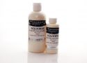
The final layer on the berries came in the form of Aquawax. Aquawax is a great product that I have used in resist techniques but it is also great for adding a sheen on the top of your Brusho. After allowing the colours to dry I dabbed on the wax with a brush to form a nice soft sheen layer over each berry.
The wax looks cloudy at first but dries clear.

And here is the finished piece with touches of Aztec gold splattered for extra bling.


I hope you like it.
If you have a go yourself we would love to see what you come up with. Leave us a comment.

Bec


Warning: getimagesize(include/images/thumbnails/125/37843): failed to open stream: No such file or directory in /var/www/vhosts/smouwen.nl/thumblinky.nl/preview.php on line 85
Related Posts Plugin for WordPress, Blogger...