Hello!
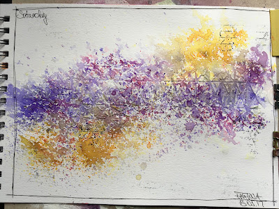
It's my turn again and this time I would like to share with you an easy and fun art journal spread.
Whenever you feel the need to make something pretty but only have a couple of minutes to spare... this one is for you!
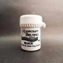
All you need is your art journal (of course!), black and white pen, stamp, black ink pad, a stencil, texture paste and 3 of your favourite Brusho powders (yes - 3, you will have to make some difficult decisions here!) - go for two analogous colours and one colour to complement them. I went for Violet and Purple and chose Yellow to complement them.
Here we go... let's do it!
Start by drawing a frame around the page with a black pen.
Stamp out some background designs - focus them mainly around the middle of the page as this is where the whole design will be focused.
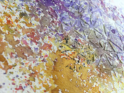
Run texture paste through a chosen stencil. you don't have to fill in the stencil completely - let it be slightly grungy; this will allow the Brusho to flow more freely, too.
You can skip this step but I always test the powders I have chosen to make sure that the colours work well together.
Sprinkle the analogous colours (Violet and Purple) over the stencilled area and the complementary colour (Yellow) on the edges.
From a distance, delicately spray the page with water. Don't spray it too hard as this will cause the colours to blend and you will loose the spotty effect and the various shades of pigment.
If any of the colours is not vibrant enough, sprinkle some more powder where you want it - the water already on the page will make it dissolve.
Dry it with a heat gun or, if you're patient enough, leave to air-dry.
Once completely dry, use white pen to outline some of the stencilled shapes on the background.
That's it! Quick and simple!
You can also watch the tutorial on our YouTube channel:
Thank you for joining me! Have a great day!
Ewelina


I love how simple the process was but how amazing the result is, so much texture and prettiness
ReplyDeleteSuch a pretty result, but a bit earthy too. I love the combination of colours you've used.
ReplyDelete