

Manila paper tends to suck the colour out of everything and I wanted to have a bit of white space so I started with a layer of white gesso, feathered out so there were no hard lines. Then I added a bit of light background stamping and stamped my title on to tissue paper.

I painted the back of the tissue paper white so that it would stand out against a coloured background...

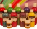
and I added Turquoise acrylic paint to the cover, again feathering out to avoid hard edges.


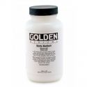
To take the title stand out more, I added a light touch of Cadium Yellow and used gel medium to stick down the tissue paper adding a coat under and over to be sure it was well adhered. I added a third lot of stenciling too.

Mixing Yellow and Scarlet paint for a bright orange, I added more stenciling and doodled round the stars and circles with black and white pens. I used Black Acrylic Paint to sponge round the edges of the cover.

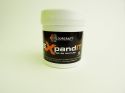
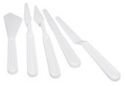
For more texture and contrast, I stenciled Black Expand-IT paste on to the cover. I also added lines with the edge of a paint knife to the 'Art' letters, and heated the Expand-IT to puff it up for some volume.

Bye for now
Karen
x
 |  |  |  |  |
 |  |  |  |

No comments:
Post a Comment