
Happy Friday!
Aren't the weeks just flying by?!
I'm back today with a Floral Brusho project. A beautiful Iris that captured my attention at Stonyford cottage gardens in Cheshire became my inspiration for a Painting in Brusho and I had the pleasure of sharing this with a wonderful group of artists in a recent workshop. So I have also included some photogrpahs of their work in progress on the day.

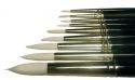
This piece is all about the flow of water. Allowing the Brusho to swim and glide on the paper surface and just encouraging it gently to move with a brush. And using a large piece of paper. Go larger than life to really create a huge flower with maximum impact.

Draw out
your image in pencil on a good quality watercolour paper. I used an A2 size 300gm Bockingford.
Apply some
small areas of wax resist for the highlights on the petals.
Generously wet the paper on one petal and sprinkle Brusho onto the outer edge. Using your wet brush drag the sprinkles towards the flower centre. This has the effect of diluting the Brusho colours into a variety of tonal shades.
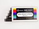
Colours
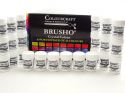
used here are Purple, Lemon, Light Brown, Rose and Orange.
Some areas
have been smoothed with a wet brush to wash the pigment into washes whilst tipping the paper to allow gravity to carry the Brusho crystals along the paper surface.
Other areas such as the stem remain as the sprinkled texture.


Allow these first layers to dry.
Then you can add further detail on the top. Mix a colour on your palette apply a small area onto the petal or stem then move or scratch the Brusho around with a Plastic palette knife and adding more sprinkled
colour as you go.
The next photographs show you how attendees of the workshop approached these first layers.


Use this
opportunity to unleash your creative individuality with bold or delicate brush
shapes, dribbles of colour, extra background washes and the potential to bleach out some colour for
highlights.
Your
painting can become whatever works for you and does not need to look like the
original flower or photograph to become a successful painting.

I've included a couple of iris images if you would like to have a go yourself. We would love to hear from you and see what you get up to. so please do get in touch.
Bec


 |  |  |  |  |
 |  |  |

No comments:
Post a Comment